Monday 4 March 2024

Uranus

Uranus by GothicNarcissus Uranus, the planet of change, enlightenment, innovation, originality and individuality.
The first Generational Planet, it represents freedom, evolution, technological advancement, an unconventional approach to life, self-expression against old traditions and limitations. On the downside, it embodies irresponsibility and petty, pointless rebelliousness.
Considered a “higher octave” of Mercury, Uranus develops its intellect into ingenuity and represents a person’s higher self.
Ruler of Aquarius, it has its exaltation in Scorpio, fall in Taurus, detriment in Leo.
Its glyph represents the planet surmounted by a stylised H for Herschel, and may be taken as meaning Matter over Spirit through the Soul’s receptivity.


Uranus is the first “modern” planet. While technically bright enough for a very, very good eye to see unaided on a very, very dark, moonless night, it’s still ridiculously faint and slow enough that its proper motion relative to the starry backdrop can go unnoticed. There’s a long history of possible sightings as early as classical antiquity, but it was consistently mistaken for a star until 1781, when British astronomer William Herschel… mistook it for a comet instead. A very weird one. But in his defence, until that night nobody since antiquity had ever discovered a new planet – only some of Jupiter’s and Saturn’s moons had been discovered by telescope till then – and the very concept was considered preposterous because of lingering Christian cosmology and stuff. But as the news spread across Europe, other astronomers observed it and confirmed that no, William, that’s not a comet, you’ve discovered a brand new, full-fledged planet. Imagine that!
It was groundbreaking: for the first time, the boundaries of the Solar System had grown! And fun fact, that would eventually snowball into the discovery of Neptune once discrepancies between the predicted and observed orbit of Uranus led to the conclusion that an outer planet was gravitationally perturbing it. Uranus literally revolutionised our understanding of the Solar System in as major a way as the adoption of the heliocentric model did.
There was much debate over what to name this new planet – some proposed Herschel after its discoverer, he himself suggested Georgian Planet for King George III, the one from the Bridgerton spin-off – until it was agreed to keep the Greco-Roman deity tradition and go with Uranus, the Greek god of the sky. From what I gather, Neptune was put forward, but ultimately Uranus won out because it was the father of Saturn, who was the father of Jupiter. It made sense and worked fine until the next planet showed up and ruined it.

Now, if you’re familiar with Greek mythology, you’ll know that Uranus is... kinda vague, like all Primordials. He was an instrument of Gaea’s creative force, then a limitation upon it, and then, after his castration, he all but vanished from the scene. Not much change, innovation or independence on his part – if anything, he was the recepient of his son’s revolution, the status quo that got swept away. All the Classical Planets derive their symbolism from their respective deities through century-old, established traditions, whereas Uranus seems to have little to do with its namesake – and even its name was arbitrary to begin with.
Well, it would appear that its symbolism is derived more from the context and circumstances of its discovery: the Enlightenment, an age of positivity, technological and social advancement, new discoveries and overcoming of the old systems. And also, by the revolution that its discovery represented: Uranus was deliberately juxtaposed to Saturn, who represents limits and was, at the time, scientifically the literal boundary of the Solar System, which Uranus all but smashed.

As I was developing the project, Jimmy Richter and I hadn’t collaborated in ages, but he was my first pick for the model nonetheless: for the inevitable puns, obviously, but also because he’s an unconventional, often iconoclastic creative force that would fit the theme to a T. I knew he would be down for it, and indeed it was one of the shoots we scheduled when I went to spend a week at his place in summer 2023.
My casting choice paid off big time: one of the best things about working with Jimmy is just how incredibly committed he always is. When I explained him the concept, he contributed actively to the development of the visuals and even volunteered to acquire a few proprs that ended up making all the difference.
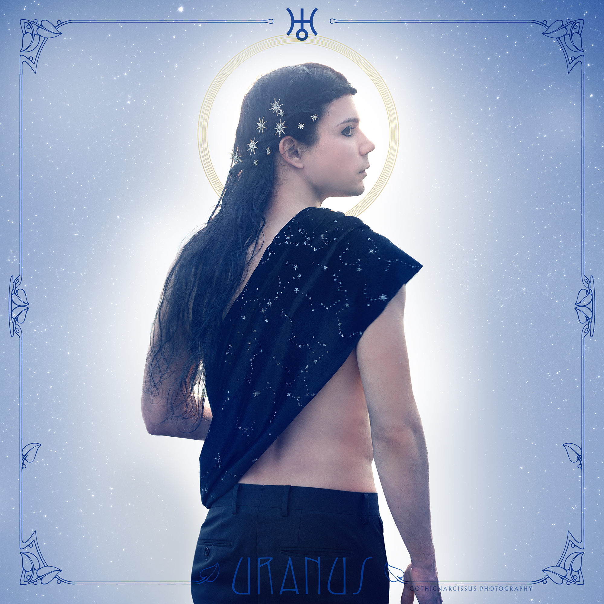
I decided from the get go I would draw both from the properly astrological theme and mythological one when constructing the symbolism: the former I would convey through Uranus showing his back and looking rightward, both indicators of a focus on the future, as well as having him bare-chested, with just some loose fabric half-covering his torso, as opposed to Saturn’s more turtleneck or Jupiter’s suit, both conventional. Also, a scarf, stole or similar would be a call-back to Mercury (more on that later), creating a sort of “trilogy” with that and Pallas.
As for the sky god part, I opted for adding star-related elements to the image, but in my mind that would mean just the background. Purchasing the starry hairclips and stole to further reinforce the connection was Jimmy’s idea, and visually that’s become a pivotal part of the the image. Really, he made this photo just as much as I did!
 
With preproduction done, once we met up and got to shooting, the weather had us do some juggling and almost had us reschedule for one of the next days, but in the end the lighting conditions were great and the location Jimmy had suggested perfect, which allowed me to work with natural lights like the rest of the series, and that, once again, paid off amazingly with a warm, natural glow that shows even through the colour filter. The shoot itself was a relatively smooth although we tried several different variatons on the pose, but in the end we did everything quickly enough to get back home on perfect time for some delicious pizza afterwards!
 
Postproduction-wise, as soon as I decided my planets would all have halos, I thought Uranus’ should look as much as possible as its own rings, which appear “vertical” compared to the ecliptic due to the planet’s extreme axial tilt. This would in turn make the halo look like a powered up version of Mercury’s, which fits the idea of Uranus being its “higher octave” conterpart. This “octave” concept refers to the three Generational Planets being seen as “collective” versions of the three Personal ones: Mercury and Uranus are the mental duo, with Mercury representing individual intellect while Uranus is the collective one.
When choosing the main colour, I once again paid tribute to Sailor Moon, but Sailor Uranus is a bit tricky because her theme colour is navy blue in the manga, but wavers between that and golden yellow in the Nineties anime. I opted for navy because it would fit the starry sky theme better, but deliberately included a noticeable yellow accent with the halo – after all, yellow is the accent colour of Sailor Uranus too, and would definitely strengthen the visual connection.

Now, when publishing Pallas I had teased that this photo had already been taken and was only waiting to be edited. I did that around November 2023 (which means it took me forever by my standards), but I kinda sat on it until now partly because Jimmy and I had already scheduled up some other content to get the juices flowing, parly ‘cause I’ve been having a lot on my plate in other areas of my life for circumstances outside of my control, so my priorities and mental resources have been elsewhere.
Now, if you remember our astrology lesson with Saturn, he’s the one that dishes out limitations and especially tests that are outside of one’s control (if we want to make meaning out of casuality, it’s currently in Pisces, square to my own sign); maybe it’s the right time to bring up Uranus to kick Saturn in the butt, wipe away that heavy energy and refresh the scene a bit.
Let’s hope this release is topical and we get a little good revolution over here.

Saturday 30 September 2023

Guilt

Guilt by GothicNarcissusWhen I go
You will be someone new,
You will see the stars come out,
You won’t feel the pain I’ve caused at all.

‘Cause someday
I must face up someday
You’ll be better off on your own,
So just let me go.

Under the bridge
I’ll carry this guilt
No more.
So under the waves
And out of your way
I’ll go.

When I’m gone
You will find someone new
And he won’t lie or torture you,
And you won’t cry for what you’ve lost at all.

And someday
When you wake up happy
You will thank the Lord that I’m gone,
So darling, be strong.

I’m under the bridge,
I’ll bury this guilt
Forevermore.
So under the waves
And out of your way
I’ll go.

[ Guilt – Hurts ]

Honestly, the idea for this photo is so old I don’t even remember when exactly I first got it. It may have been as soon as I listened to the song for the first time, really, which would make it ten – ten! – years old.
I know for a fact, though, that I already had it by mid-2015, because I happened to visit Sagrado, a small town not far from Trieste, and when I saw its old, steel bridge across the Isonzo river, I was in complete awe of it and thought it would be the perfect location to shoot that photo. Which means the idea was already formed. And since it hasn’t changed at all since then (almost, we’ll get to that later), it means it’s was already quite finalised even then.

The problem is, if Stay has taught us anything is that specific locations mean you have to rain-cheque that idea and wait for the right chance. While Sagrado can be reached by train from Trieste, and the bridge is within walking distance from the station, the logistics were still a bit of a nightmare. You see, I needed someone to help me shoot it if I were to take a self-portrait, since setting the camera on a tripod and leave it unsupervised on a pebbly river bank was out of the question, not to mention making sure I was in frame and everything. And those were the years where I was quietly but steadily made to feel like my photographic ideas were becoming a burden to certain people close to me, so I wasn’t comfortable pressuring anyone to take a trip to help me.
True, come 2016, I did have some hypotetical talks with my friend Giulia (who eventually helped me on Wonderful Life), and while she would have been glad to come along and assist me, fitting everything in our schedules wasn’t exactly easy. So another three years passed without me really pushing the matter, and then the early Twenties happened, with all the delays and roadblocks they brought along while I was stuck in Sardinia till mid-2022.

Cue Marko and me becoming flatmates. We made several trips to Ikea to buy some stuff for home, and to go there from Trieste we not only had to pass through Sagrado, but actually cross that very bridge. Which obviously reignited my interest in the project.
And while I had initially envisioned Guilt as a self-portrait, there was really no reason at all why it had to be. I might as well have Marko model for me while I chilled behind the camera, cutting the overall work by a good two thirds. He agreed and, while going to Ikea again, we inspected the river bank to see where we could best find access to the shore underneath the bridge, and as soon as we were both on holidays I checked the weather for cloud cover and we went there to shoot.

Now, aside from the photo going from a self-potrait to one of another model, the only major change in the overall idea is that, for whatever reason, I was expecting to shoot facing upstream on the left bank of the river, whereas we found out the right bank was more accessible so we shot facing downstream. But that didn’t really impact the aesthetics or composition at all.
The original idea was always a monochromatic piece with murky sky, the bridge prominent on the background (because it’s the most strikingly visual part of the lyrics), with a perspective that would make it stand tall above the model, who would be wearing a long coat and walking away from it. Simple, yet effective.

To be honest, though, I think part of the reason why I felt the need to take a break this year was that I couldn’t bring myself to choose one take to work on, let alone go through with editig it. Perhaps I was afraid that the photo wouldn’t live up to a decade of expectations. Which it did: save from the change in model, it’s literally plucked out of my mind from 2013. But much like Pallas, perhaps it needed a bit of mental distance for me to get over myself and truly appreciate my work here.

So there we go: one of my favourite Hurts song turned into a photo I really like, after I nurtured this idea for a long time. It feels rewarding to finally put it out here.

Thursday 28 September 2023

Pallas

Pallas by GothicNarcissus Pallas, the planet of wisdom, creative intelligence, logic, diplomacy and social justice.
The second of the Asteroids, it represents the practical application of intelligence, as well as a creative approch to problem-solving, mediation in a conflict, and the bridge between logical thinking and intuition. It also cautions against uncompromising, absolutist points of view and intellectual presumptuosity.
As an Asteroid discovered in modern times, it does not rule over any Sign, nor does it have a fixed point of exaltation, fall or detriment.
Its glyph represents Pallas Athena’s spear, and may be taken as meaning Spirit presiding over Matter.


That’s right, my pretties, we're not stopping at the “mainstream” planets: we’re including the asteroids too! They’re comparatively obscure in astrology, but some astrologers do include them and, in my opinion, they add  some intersting symbolism which complements that of the “main” planets on the birth chart.
But first, a little history lesson: scientifically, Ceres, Pallas, Juno and Vesta were all, at some point, considered proper planets. Upon discovery, they were classified as such, and made the list alongside Mercury, Venus, Earth, Mars, Jupiter, Saturn, and fellow newcomer Uranus for over half a century. When more similar bodies started popping up in droves, astronomers decided a reclassification was in order, and the term “asteroid”, which had existed in parallel to designate them (because they were too tiny for 18th Century telescopes to resolve their discs, thus they appeared as “star-like”), was adopted to designate them instead.
This is a testament to just how fluid the term “planet” has historically been, initially including the Sun and the Moon, and even the “Medicean Planets”, aka the four major moons of Jupiter, as Galileo originally called them. Which basically means that yes, Pluto apologists, it’s time to build a bridge and get over it: it's not a planet anymore, but it's still awesome.
Of course, astrology not being a science means it can straight up ignore scientific nomenclature (hence why I find it absurd that astrologers have been debating the Pluto situation too)… as it has been for centuries! I mean, not only does it still include the Luminaries among the planets, but it’s still geocentric in its essence, for crying out loud. So I’ll just be calling the four main Asteroids and Chiron “Planets” in my posts, since they act as such on one’s birth chart.
 
That said, the time stamp on the draft for this post dates back to the 5th of April… and now it’s late September. That's because I took the photo all the way back in March, started editing it, and… left it there. Just like that. It’s partly because I had unnecessarily complicated my life on the spear tip (which I resolved in five minutes square when I rerally got down to it), but mostly because I think I just needed a break from photography in general. After Pallas, I shot nothing and edited nothing for a few months, focussing on creative writing instead, until I felt ready to pick up the camera again.
I should have probably seen that coming, as the shoot itself didn’t go as smooth as others tend to do: I kept shooting take after take after take, trying different set ups, different poses, different anythings, waiting for the Sun to set a bit so the light would change, never quite satisfied with the result. And then I ended up using one of the first takes, right after the warm up shoots, because it was just what I had envisioned. It could have been a five minute shoot, but I didn’t trust myself enough to bring it home and be happy with it.
So yeah, I definitely did need a pause in general, and also from this project specifically, to gain enough clarity to pick it back up with the enthusiasm it deserved.
 
One thing I did not struggle with was pre-production: I built Pallas’ symbolism around the concept of wisdom and practicality, and also envisioned him as a bridge between Mercury and Mars (which I have already conceptualised), acting both as a complement and foil to them. Where Mercury holds a smartphone, a source of raw information, Pallas has a book, which codifies it into wisdom. He also keeps his spear behind himself, as a backup for his plans, whereas Mars will keep it in front because he’s the one who tends to charge first and think never.
I also decided from the start to style Pallas with layers: a leather jacket (leather being often used for armour) on top of a white, soft shirt or t-shirt to represent Pallas’ duality as a tough warrior but also a wise craftswoman.
I luckily had a very nice-looking brass curtain pole I knew I could use for the spear, which I had to carry to and from the location by bus, but you know me, at this point I’m completely out of fucks to give what anybody thinks when I’m out to take photos. Had it not been for my little artistic block, that would have been the only challenge (a piece of cake compared to Saturn’s scythe).

As for the final touches, cyan is the main colour as a nod to Sailor Pallas. Sailor Moon fans who only grew up with the 90s anime might be confused here, but in the manga Palla Palla from the Dead Moon Circus was actually a brainwashed future Sailor Pallas, the Asteroid Senshi being Chibiusa’s own future guardians. So that theme colour will stick for the other three Asteroids as well.

On a more personal level, I find it interesting that, like it or not, I end up learning from what each planet represents when working on this series. If Saturn taught me perseverance in the face of obstacles, and Jupiter inspired me with optimism against overthinking, Pallas gave me the wisdom to acknowledge I needed a break and allow myself to take it. If I want to respect my craft, I can’t just force it.
And now that I let the fire reignite, I have enough enthusiasm to see if I can tackle a couple more photos from this series.

The next one is actually already shot and only needs editing (you’re gonna see an old, familiar face, but if you’ve been following me on Instagram you already know who), so it won’t take long. As for further works, it’s best just not to promise anything timelinewise, but I'll keep an eye open for the possibilities.

Sunday 28 August 2022

Jupiter

Jupiter by GothicNarcissus Jupiter, the planet of generosity, abundance, growth, higher ideals and trust.
The first Social Planet, it represents good luck and prosperity, governs optimism, life improvement, and how gratitude is expressed. It also warns against blind optimism, naiveté, and overindulgence.
Ruler of Sagittarius and Pisces, it has its exaltation in Cancer, fall in Capricorn, detriment in Gemini and Virgo.
Its glyph represents the Greek letter ζ, the initial of Zeus, and its meaning is Soul transcending Matter.


Last autumn, when I published the previous Planet, I wrote that “I’ll surely be back in Trieste scouting for oak leaves for Jupiter in the spring”.
Well, it took me a little longer to come back, but one of the first non-strictly-logistical things I’ve been up to upon returning was, in fact, setting up the fourth entry of my Wandering Stars project. It’s just… better not put time stamps on these things, I guess?
Anyway, this is another of those early bird ideas that I’d had when plans for a series were still in the earliest sage: I remember casting Jupiter as far back as 2018, with my friend Mark Turtoo agreeing as soon as I asked, and me calling a raincheck on that while I decided how to go about the project as a whole. I mean, look at him: Jupiter is traditionally represented as a handsome, bearded but still youthful man, and Mark fits the archetype to a T.
Not only that, but Mark is also hands down one of the best photographers I’ve ever had the luck to meet. His personal work is just beyond-words amazing and you should check it out if you haven’t already; also, his approach is obviously serious and professional: if he says he’s down for the project, he’s a guarantee. So when I returned to Trieste, he himself remembered we had this thing on hold, and when I dusted it off the shelf we were ready to shoot within a week or so. As easy as that. Even though so far this project has been met with the utmost support and enthusiasm by all the models I chose, it’s still a great reminder that the famous incident that shook my confidence a few years ago was just that: an incident, a one-off thing.
 
In pre-production, each photo from this project so far has presented me with a different challenge, mostly because, as someone once said, I’m too ambitious for my non-existent budget. Venus had the Margaery hairdo, Mercury the backlit wings, and Saturn the scythe.
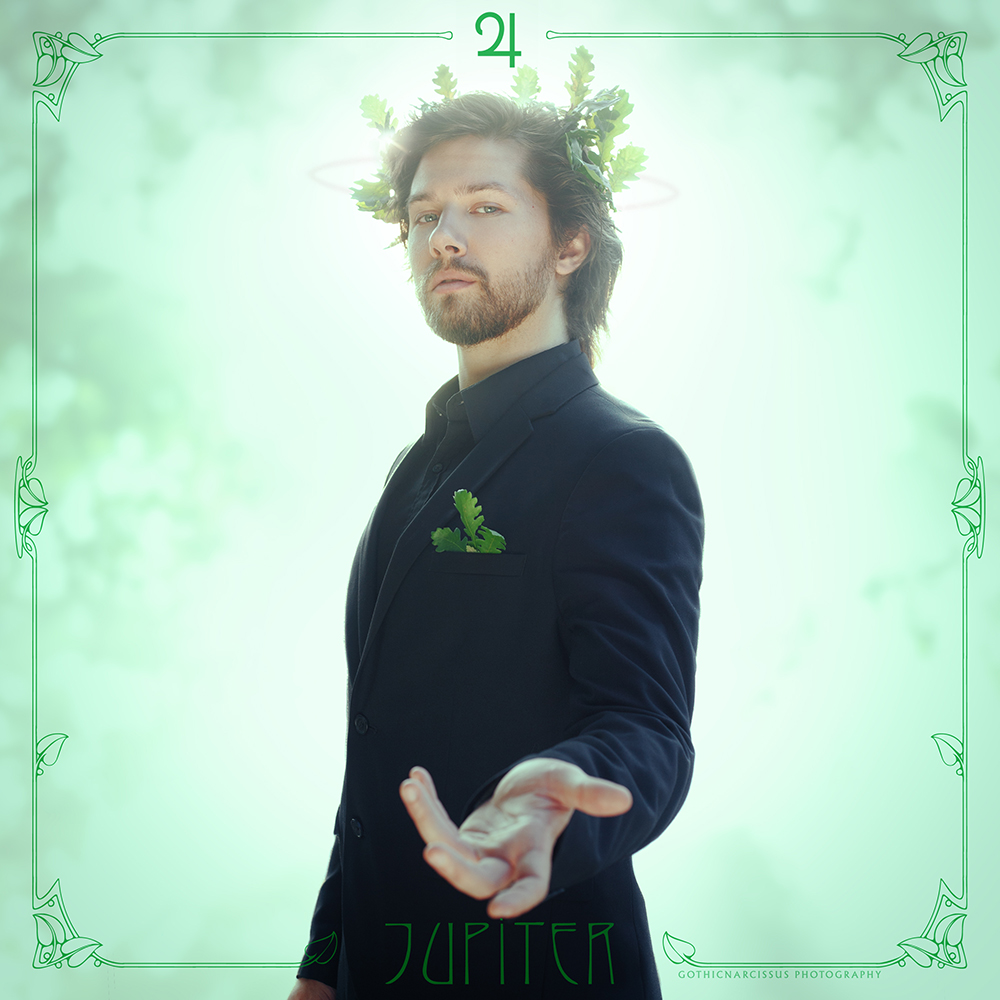
Jupiter’s challenge was the oak leave wreath: I’m not as familiar with the flora in Trieste as I am in Alghero, and I really had no idea where oaks grew here, if they did at all. Luckily, Trieste has a handy online guide for all its parks, which not only informs on what service they provide, but also lists what species of trees grow there. After a first unsuccessful attempt near my place (there were ilexes instead of common oak), attempt number two was a success: not only did the park have oaks, but the entire hill was covered in them, so I could forage to my heart’s content! The reason why I chose that specific park was its relatively modest size, which would make finding a certain species of tree easier than having to explore an entire hill, and my intuition paid off so well I didn’t even have to search.
Also, given the choice I opted for downy oak rather than common oak because the leaves are equally lobed into that distinctive shape, but smaller and thus better fit for a crown.
Why was I so adamant about oak leaves? Because they’re a symbol of Zeus / Jupiter, of course! I didn’t really want to overdo the editing with fake lightning or stuff like that, and a nice crown of oak leaves was the best option to convey Jupiter’s symbolism, kingly attire and mythological theme.

As I mentioned in Saturn’s entry, I had decided to style both him and Jupiter in formal-like attire to convey the adultness that both planets bring about in one’s birth chart. As Saturn got the turtleneck and light blazer, Jupiter got the dress shirt instead, black like the jacket instead of white because Mark favours total black and I respect that.
Another styling change I made last minute was the pocket, as I initially considered having a red pocket square to reference the Great Red Spot, but ultimately decided against it because it would be a bit random, opting for more oak leaves instead to tie the outfit together with the wreath.

If you follow me on Instagram, you might have seen from my stories that the shoot itself had a few hiccups. Aside from a brief struggle to find a suitable location that faced west, had a relatively clear background, and hadn’t been closed off recently unbeknownst to us, once we found it (the same spot as the very first shoot I did when I moved to Trieste, imagine that) we got some unexpected cloud coverage that killed the light and slowed us down. Thankfully, Mark is a real professional and, therefore, knows photographers have no power over weather, so we just chilled and waited for an opening to resume the shoot and get that golden backlight I needed.
Then again, we’d moved well in advance so we could reach the location and style him with no rush, so there was still plenty of time before sunset. It worked for the best anyway, because that gave the Sun some time to get lower, which allowed me to shoot from a more favourable perspective while having the flare right behind Mark’s head.
On a side note, even though I have now access to my lighting equipment, I’ve decided I’ll keep working with natural light because, while more difficult, I’ve just fallen in love with the natural effect and golden hue it gives, so I’ll just keep pursuing these aesthetics.
As Jupiter’s trademark item was headgear and not something to hold, I struggled a bit to come up with a suitable posed, but eventually decided to have him reach out with his hand, in a gesture that could either be him granting good fortune to the viewer, or inviting them to trust him and join in on his bountiful gifts. Needless to say, Mark just nailed it after a couple of warm up shoots.

Postproduction-wise, green is once again a reference to Sailor Moon, being Sailor Jupiter’s signature colour. Unlike Saturn, where I kept some of the originally background for texture as an afterthought, here I deliberately went and shot some tree foliage separately to add afterwards and fill up the background.
Also, this is the only time so far when the halo gave me a bit of a headache, as I didn’t want it to distract from the existing head gear. I decided to make a very subtle, planetary ring-like one to reference Jupiter’s faint, elusive dust ring.
 
One thing of note is that I approached this specific photo with a much more optimistic, relaxed attitude than I usually have when doing something from any of my long-term projects. I’m not sure if that’s because I’m so overstressed in general that I just can’t bother, or because working with a professional is a guarantee… or maybe because Jupiter is the planet of optimism and luck and it brightened up its own photo. If that’s the case, Pluto, please have mercy!

At this point, four photos in I can say the project has found its footing and aesthetics. Jupiter is perhaps the idea that changed the most from inception to completion, because I distinctly remember envisioning Mark against a velvety dark green background with side lighting, not unlike Undo Your Mind, while the final work has this airy, light, ethereal quality to it.
In the end, while changing the light conditions to reflect the relative position of the planet compared to the Earth and Sun had merit, I’m glad I decided to go fully backlit because it starts from a general premise that’s very similar to the Infernal Lords – a series of archetypes rooted in occult traditions, but given a modern spin, each with its signature colour – but takes it in a completely different direction visually.
It’s rare that I’m so satisfied with my works, both on their own and compared to what I did before, but the more I look at these four photos so far, the more I can’t wait for the next tone to be done.

Monday 25 October 2021

Saturn

Saturn by GothicNarcissus Saturn, the planet of order, limits, boundaries, obstacles and responsibilities.
The second (and last) Social Planet, it represents all the external forces, hardships and authority figures that shape the character and help bring discipline and maturity. It also represents the fears and blockages to overcome in order to find stability.
Ruler of Capricorn and Aquarius, it has its exaltation in Libra, fall in Aries, detriment in Cancer and Leo.
Its glyph represents Cronus’ scythe, and its meaning is Matter ruling over Soul.


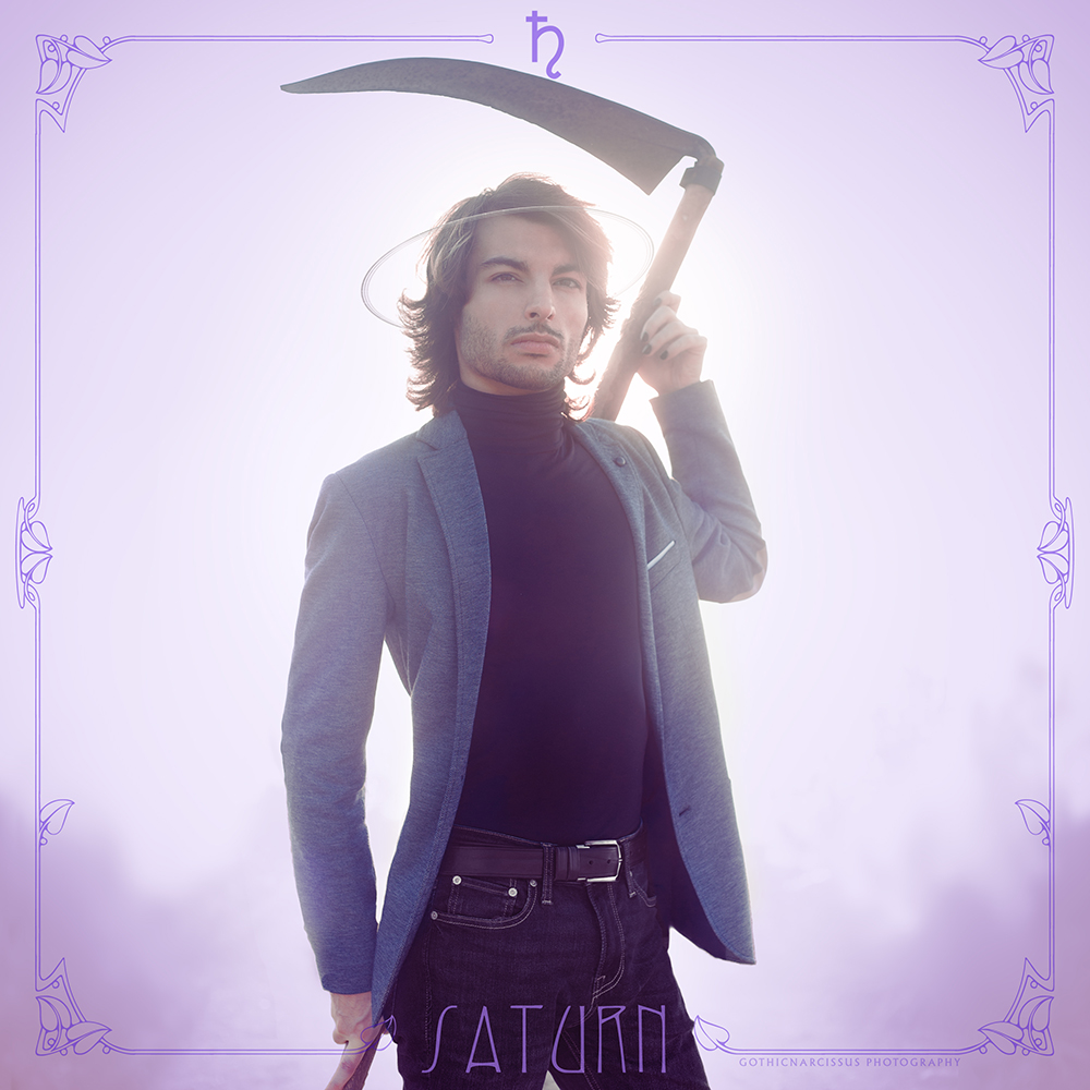
The third entry of my Wandering Stars project posed an interesting challenge to me: finding a scythe to use as a prop. The scythe is an integral part of Cronus/Saturn’s iconography – it’s the tool he used to castrate and defeat Uranus – and it’s even represented in its glyph. Now, originally it was probably sickle, not a scythe, but centuries of conflation of Cronus and Chronos, which eventually resulted in the iconography of Father Time first and the Grim Reaper later, cemented the association of Saturn with the larger scythe, which I decided to use; besides, the smaller sickle is the glyph of Ceres, so I’m saving it for that photo.
Now that I decided the entire project would be backlit and not only the Inferior Planets, finding a scythe was pivotal, as adding anything digitally on a backlit photo is tricky and risks compromising the photorealism. Besides, it had to be a real one, as Halloween props and plastic things look aggressively fake and cheap.
So yeah, for once the difficulties in this photo were not self-imposed or an attempt at self-sabotaging, but a necessity – true to the planet I was going to represent. The good news was, I had chosen a friend in Sardinia as the model for Saturn, and Sardinia has plenty of rural communities that would make it more likely to find such an iconic agricultural tool.
In an ironic twist of fate – in that Saturn represents authority figures and father figures in particular – the answer to my conundrum came from my own father: I asked him if he or anyone in his hamlet had a scythe, and lo and behold, he found one at my cousin’s. This is interesting in that it’s the second or third time in fifteen years that he’s contributed in any meaningful way to my photography – the first being when he bought me my first compact camera at age fifteen, before I even started doing this, and the second when he drove me to the Seredda casa cantoniera and cut down some canes to give me a better view for the photo.
It took him a while to retrieve it, but when he did I contacted my friend Shinigo, scheduled the shoot and had the scythe brought to me – finding out it was basically antique with a beautifully rusty blade and a textured wooden handle that would look better than any modern tool on camera.

Styling-wise, Saturn is, along with Jupiter, one of the “adult” planets, which is why I wanted them to be wearing semi-formal attire with blazers or jackets. I wanted to differentiate the two, so when Shinigo told me he had a grey blazer to be worn with a black turtleneck I was enthusiastic, as that meant I could easily have Jupiter in a black jacket and white shirt to look distinct enough. A little detail I added last-minute was the black nail polish because let’s be real, Saturn is the corporate goth of the astrological Planets, it fit perfectly.

The shoot itself wasn’t difficult – my biggest concern was parading near the local police station with a huge blade on a stick to get on location – but luckily we didn’t get arrested, nor did anyone get killed, maimed or contracted tetanus from the rusty blade. We had to slightly change location compared to Venus or Mercury because the sun now starts descending further south and I’d have too much clutter in the background, but the new location gave us a nice support to the scythe, which Shinigo could wield more easily and less tensely. He nailed the pose pretty much since the first moment, and most of the takes were me moving around to get the best flare behind him.

In postproduction, I obviously opted for purple as the main colour because, once again, that’s Sailor Saturn’s theme colour. As the original background wasn’t completely blank this time, I decided to leave the tiniest hint of it in the lower corners to texturise a bit the photo. I also decided to leave the golden hue of the light to give more chromatic dynamism to the image. Since we’re now officially doing the halo thing because I can’t help myself, I positioned Saturn’s in a way that’s reminescent of the planet’s rings to give it a bit of astronomical connection too.

And here we are. I’m extremely satisfied with the final result and, much like Saturn’s astrological symbolism, all the roadblocks and challenges ended up shaping the photo for the best.
There are no immediate plans for other Wandering Stars at the moment because I don’t quite know what my life plans are in the short term, but I’ll surely be back in Trieste scouting for oak leaves for Jupiter in the spring. In the meantime, I’m glad this project is shaping up with its distinctive aesthetics. I’m really glad I’ve started working on it.

Sunday 25 July 2021

Darkest Hour

Darkest Hour by GothicNarcissusHold on,
I’ll be home soon
‘Cause I know
There’s nothing more that you can do –

When suddenly, it all fades to black,
Suddenly, it all goes away,
Suddenly, you’re on your own
And struggling to breathe again.
I know it isn’t easy for you,
Knowing there’s a war in your head,
Knowing that your body isn’t
Strong enough to reach for help.

But in your darkest hour
I will the light the way,
I will help you cope
Through the hardest days.
When it all breaks down
I will keep you safe,
In your darkest hour
I will light the way.

So hold on
With all that you have left.
We can take it step by step:
Just do your best, acquiesce.

‘Cause everybody looks just like you
But they can never know how it feels,
They can never know of all the suffering
That you conceal.
How did it end up this way?
How much more can you take?
Will you ever find the strength
To get back on your feet again?

But in your darkest hour
I will light the way,
I will help you cope
Through the hardest days.
When it all breaks down,
I will keep you safe,
In your darkest hour
I will light the way.

So hold on
In your darkest hour,
Just hold on,
Hold on.

In your darkest hour
I will light the way,
I will help you cope
Through the hardest days.
When it all breaks down
I’ll keep you safe,
In your darkest hour
I will light the way.

[ Darkest Hour – Hurts ]

Yeah, well. Remember all my high proclamations of never ever saving another photo from the Inspiration Hurts project for close friends ever again, to stop taking photos that double as tokens of affection, love is weakness, I’m Regina the Evil Queen, and all of that? I can’t. I mean, I tried. I… okay, let’s rewind.
Look, my dear friend Luisa just happened to be in town specifically to model for me – yeah, imagine that – and since there was her, and there was me, and this photo needed two people to tango, I decided to throw it into our session. Seize the moment, now or never, all that staff. It just so happens that the song it’s inspired by is also very appropriate for the two of us, and that’s a nice bonus that… okay, no.
Really, I just wanted Luisa to be in this photo, and she just happens to actually be a good friend who cares about this stuff.

Luisa and I go back over a decade. We’ve both been through some darkness and, even though we’re not the most talkative of people, we’ve always been there for each other if need be – basically, this song works both ways for us. Besides, she is the one who introduced me to Hurts’ music in the first place by suggesting the concept for Evelyn, so this song and the related photo just had to be ours.
Also – did I mention it already? – a very good friend of mine comes to Sardinia not just to mind her own business but actually to take photos with me, and we end up taking an Inspiration Hurts photo that doubles as a token of affection and a symbol of how much we care for each other, and we actually go through with it, and she doesn’t even have to manipulate or gaslight her way out of it – I mean, could I ever in a million years pass on such a chance to stick it to a certain someone? Of course not, I’m just that petty.

Speaking of petty, if this composition reminds you of a certain other photo from the Inspiration Hurts project, one from a song that’s all about “please save it and get lost”, one which has aged better than the finest vintage you’ll ever drink like I’m a goddamn prophet or something… yeah, that’s deliberate – that’s literally the entire concept.
I took the basic premise of that photo – boy and girl, he to the left and she to the right, sitting and looking out to the sea – and flipped everything else: this one is in colour instead of monochromatic, the sky is clear instead of heavily clouded, the image is sharp instead of grainy, and we’re touching instead of just sitting there side by side contemplating the silent yet inevitable demise of our relationship before one of us walks away, and it’s closely framed around us rather than being wide and including lots of background.
I really wanted to mirror that photo to hopefully make another “prophecy”, that Luisa and I will weather the darkest hours silently having each other’s back, and that brighter times will finally come.
Because there are people in my life who do deserve photos that double as tokens of affection, goddamnit. (Just so you know it, I still hold a grudge for things that went down on my seventh birthday, so no, there’s no chance I’m going to drop this anytime soon.)
 
Now, to be completely honest, you can tell that my last bad experience shooting in Sardinia with friends from elsewhere still seriously haunts me way beyond the occasional snark by the fact that I sort of felt guilty to bring up my own personal project while I was working at our joint one. Aptly, this is the very last photo we took, and initially I was even trying to take it in full daylight as not to inconvenience Luisa with having to wait for sunset on the evening before her departure, in case she wanted to rest. When it became clear that wasn’t working and I would not be able to postproduce my way out of those light conditions to achieve what I had in mind, Luisa herself was the one to suggest we’d come down at a proper hour and take the photo the way it was meant to be – again, imagine that. It was a very nice way to end our four-day photoshoot, and one which made me feel appreciated. It’s another step in the direction of rebuilding the trust in people who agree to help me with my own passion projects.

So here we are, sitting side by side, watching together as the sun rises and puts an end to our darkest hour, all with those real-life undertones that will make me cherish this photo way beyond its artistic merits.
Thank you, Luisa, for believing in me and making art with me.

Saturday 24 July 2021

Wings

Wings by GothicNarcissusWhen you find me free falling out of the sky
And I’m spiralling out of control,
When I drop like a cannonball from cloud nine,
Just promise you won’t let me go.

Say you’ll catch me when I fall,
Wrap your wings around my body
When I’m lost in the storm
And I’m calling.

Wrap your wings around my body,
Wrap your wings around my body.
Wrap your wings, wrap your wings,
Wrap your wings around my body.

When we stood on the skyline there was no turning back
And you said not to stare at the ground.
There’s a hole in my parachute as big as my heart
And the gravity’s pulling me down.

Will you catch me when I fall,
Wrap your wings around my body
When I’m lost in the storm
And I’m calling?

Wrap your wings around my body,
Wrap your wings around my body.
Wrap your wings, wrap your wings,
Wrap your wings around my body.

We’re flying above the valley below,
We’re flying above the valley below.
We’re flying above the valley below,
We’re flying above the valley below.

Wrap your wings around my body,
Wrap your wings around my body.
Wrap your wings, wrap your wings,
Wrap your wings around my body.

[ Wings – Hurts ]

My oldest notes about a concept for Wings read as follow: “She embraces her / him from behind; the arms are wrapped in flowy fabric, floating in the wind like wings”.
Wow. Boooo-ring.
Basically, I was just going to rip off Wonderful Life, but at a closer range and with floaty sleeves. Did I say, boring?
That’s one of the reasons I never quite did anything with Wings, besides the fixation that there had to be a real-life couple for sentiment and blah blah blah. That is, until mid-2019, when  I was browsing DeviantArt for witchcraft-themed photos for a feature journal and I came across Dark Water Witch by Anndr and Kabarsa. Visually striking, extremely evocative and… wait, that’s a really great idea!
What if I still had a couple, alright, but with an “angel girl” archetype of courtly poetry inspiration who’s actually down below, waiting to catch and save the boy falling from up above? Play with perspective, shoot them both separately, then flip the photo of him and mash the two images together. That’s much more visually striking than just “upright spooning with floaty fabric”.
 
At this point, my mindset was still set on “romance”, so I was still expecting to cast a real-life couple for the photo. One potential occasion I considered to take Wings was the photoshoot for Stay with Loli and Nicola, but Stay was draining enough on its own given its history, plus there was not a breath of wind in for the sleeves that day, so I gave that up. Then I was all out of couples for the next few months until, y’know, 2020 happened, which made me bury and forget this photo for a while.

Including Wings into the session with Luisa was an almost last-minute decision which, given the themes of other photos such as La Cura, I’m actually surprised I didn’t take sooner. Perhaps because I was so fixated on the romantic undertones of the song that I totally overlooked it could very well also apply to friendship. Me and a friend and my camera were a perfect fit for this photo.

Now, I knew all along that going from concept to finished piece was going to be challenging. It required two separate portraits with compatible light, enough room to make a really wide image, and an inordinate amount of editing.
I shot Luisa’s portrait first, squeezing it in-between Wave Your Flags and Glorious in a moment when the clouds got thicker and, thus, the light was at its most neutral, and then, locking the focus to have the correct depth of field, I took several shots of the background so I wouldn’t have space problems composing a panoramic picture if I had to make the image wider to fit my full figure, or even tweaking her pose according to my position if necessary.
As we were on a tight schedule with our main project, I left my own portrait for another time, which was actually a few days after Luisa even left, when I got similar light conditions to that evening. In theory, if I were falling from the sky, I would be shot slightly from below, so I set the camera on a higher position than I’d be so the downwards perspective would turn upwards in the rotated image. I also chose a light concrete setting, which would be easier to edit out of the final image against a cloudy sky. With my mother’s assistance, I took several shots while jumping to give momentum to my legs and not have my feet flat on the soil, until I was satisfied with one of the takes.
Finally, I shot the sky so I could fill in the originally horizontal picture of Luisa and turn it vertical to accomodate me.

I did the postproduction live on Discord with my best friend, who’s a paintress and could give me some advice about the relative proportions and positions of the two figures, to make sure everything clicked together. As expected, I ended up widening the background in Luisa’s photo, then added the sky to make the image vertical, and finally positioned my photo according to Luisa’s. There was also some tweaking of our poses, for which the separate backgrounds were helpful, but the bulk of the work was just to edit our the concrete around me, half of which I accomplished simply by subtracting all the black selectively from the white channels. Then a little colour filtering to make the image look prettier and ta-dah!

Now, this is one of those cases in which the final work lies halfway between actual photograph and photomanipulation. In this cases, when you’re taking a photo of something that’s not entirely there, planning ahead is vital. You need a clear final image in mind in order to take all the photos as matching as possible, and it’s also important to make a mental map of everything you might need for the final image, such as extra background shots, in order to make them as compatible as possible and make the editing process easier and the final result more photorealistic.
It is a challenge, but one that’ll leave you fulfilled and satisfied in the end.

Tuesday 20 July 2021

Glorious

Glorious by GothicNarcissusGlorious!

There’s a place I go,
A place I always stand alone
And need no witness to my throne.
Here I say my piece
And have no need to be believed:
The bridge I build will carry me
Beyond the creatures of your sea.

Glorious, pure-insular,
The very first to draw the air
And touch the earth, I built it there.
Oh glorious, glorious, ooh!

Here I win my day,
I make my kill upon the grave
And need no hero to be saved.
Here the light still shines
Despite the odds and all the time,
Despite the Gods and their design.

Glorious, pure-insular,
The very first to draw the air
And touch the earth, I built it there.
Oh glorious, glorious, ooh!
Glorious, pure-insular,
The very first to draw the air
And touch the earth, I built it there.
Oh glorious, glorious, ooh!
[ Glorious – Phildel ]

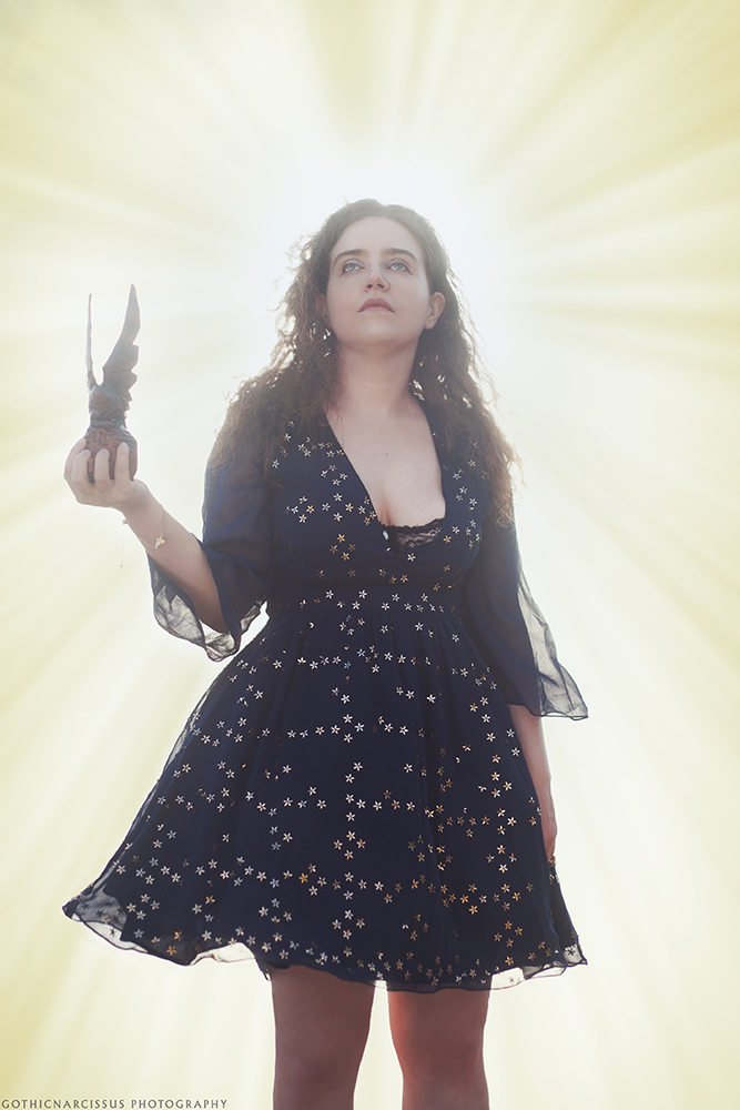
Glorious was probably the first concept from the Wave Your Flags series I came up with, before even thinking of making an entire series (though I had the feeling Luisa would agree to one). The first few seconds of the song are already so powerful and evocative that I had the full-blown image in my head (minus a couple of details), just waiting to be taken.
It also probably helped that the breathtaking aesthetics of Aurora Consurgens by my dear friend ContessaNera were ingrained in my memories, only for the song to bring them up again and influence my own photo. Beside Veronica’s work, I also drew inspiration from the Phidias’ Athena Parthenos, a (now lost) sculpture of triumphant goddess Athena holding Nike, the Winged Victory, in the palm of her hand.
And thus, the idea of Luisa holding the statuette of an eagle with its wings spread, looking triumphant against a strong light source, was born.

The styling was easy too: once we started talking about the project more concretely, I chose this dress for its metallic sequins, which would provide texture and highlights to the backlit silhouette of the dark fabric. In that regard, the sheer fabric also allowed for the breeze to give volume to the skirt and floaty sleeves, which added movement to the otherwise solemn photo.
On a side note, this photo was once again taken atop the Electric Heights stairway, the same place where I shot the Wandering Stars photos. As my light equipment is in Trieste, I had to make do with natural light, and in the afternoon that place gives a beautiful, mostly unobstructed view of the sun setting towards the sea, so the background turns out perfectly white with the sun providing the necessary back-light.
Once the photo was done, I asked Veronica for advice on how to best include sun rays in postproduction to give it that “glorious” feel.

On a total side note, the eagle statuette we used was a career accolade my maternal grandfather had earned, which was passed down to my mother. I’m glad I could include a piece of my family history into one of my works.

And this wraps up the Wave Your Flags series. I am very satisfied with this project, both for the actual photos themselves, the final works, turned out, and also how we worked while making them. We were well-organised, our schedule was tight but took full advantage of the locations so that we wouldn’t have to take too many (or too long) trips in-between shoots, and we managed to work around or push through some unexpected circumstances that came up along the way, all the while also throwing in a few photos for different projects while we were at that.
Thank you all so much for the warm reception you’ve given this project. A huge thanks to Phildel, who has kindly shared some of our photos and was super supportive of our efforts to turn her music into image. It’s always amazingly rewarding when the artists who inspire my photos find something of their work reflected back from mine.