Tuesday, 17 September 2013

Decarabia: development and symbolism

Credits:
Photo, concept, manipulation, frame design, styling: GothicNarcissus
Model, make up: Deborah Luna
Dress: DamaInNero
Hair: Arianna Clarimonde
Additional resources: Amptone-Stock (texture), BiSnarkian (Art Nouveau frame), Sinag-Stocks (branches), Princess-Of-Shadows (texture), sxc.hu (wings)

Once upon a time, GothicNarcissus went to Milan. It was a rainy and gloomy January afternoon and he tried to shoot Decarabia, the Demon of Plants, with one of his favourite friends. He just had her pose with the brand new Art Nouveau dress his mother had sewn aptly for the shoot in front of a very dim and bad frontal light from the window hoping he could do all the magic in Photoshop later. Months passed, he kept working hard and fiercely on the photo, tried to add some ivy in postproduction, to correct the light, to blend the model with the wings and the background, but to no avail. For the first time since he started the project, he had to come to terms with the fact that he needed to shoot that Demon again.
And so, dearies, this is how my Infernal Lords project hit a standstill for months: I stubbornly refused to admit the photo wasn’t right no matter what I did to it – also because I did not want to waste Deborah’s excellent modelling – and, while I kept working on it, I did not even try to organise other Infernal Lords shoots. How very clever of me. Oh wait, this is also how I screwed up my university career.
Enough complaint, let’s get back to the work. Reading again The Lesser Key Of Solomon, I’ve found that Decarabia is more closely associated with birds and gemstones than plants, but I read on other sources that he (or, in our case, she) also giveth thee knowledge about herbs and their properties. I always wanted a plant-related Demon and I distinctly remember that, out of all of those I could pick a name from, that was the prettiest (because let’s say it, Decarabia is a Hell of a beautiful name!), and this is how I chose him. Which immediately became a her, ‘cause that name sounds totally feminine.
Fleur de Saison by Emilie Simon
Fleur De Saison by Emilie Simon.
Looking back, my first idea for this Demon would have never worked. I basically wanted to copy the front cover of Emilie Simon’s Fleur De Saison single with a model who was not even really photogenic – and I’m honestly still wondering how that ever crossed my mind. Fortunately, while I was busy not organising the shoot for months, I met Deborah and, like the road to Damascus, I realised that she was the one.
Of course, changing the model I had to reconsider the aesthetics and overall mood of the work. Working on the Demon of Plants made the symbolism quite immediate, so a great deal of the photo would rely on its looks. Given how classy and elegant Deborah is, I immediately decided I would make an Art Nouveau image with a flowery frame, a Mucha-inspired pose, a fancy dress and a lot of ivy. Initially I also wanted to keep the red berries motif as some sort of “crown” or Elizabethan neckpiece of sort. Even before I asked Deborah to model for the project I made the background, which turned out gorgeous, and the rest of the ideas followed soon. I also asked my mother to sew a custom-made, Art Nouveau-inspired dress for Deborah to wear during the shoot, which looked gorgeous too. Everything was ready, I only needed to go to Milan and shoot.
As I mentioned above, Deborah an I originally shot Decarabia back in January, the week end I did Azazel with Uriele. While the latter turned out perfect, there was no way on Earth Decarabia could look fine with that photo. Deborah was gorgeous and I truly felt sorry for wasting her work, but mine just wouldn’t do. The ivy I added digitally looked as fake as it could be, the branches and berries were even worse and the bad light was beyond digital correction. I eventually scrapped the idea of the branches with red berries altogether because the photo was rich enough in details but it still looked horrible, so I took a deep breath and admitted it: I had to shoot it again. In that moment it felt like a defeat. I still have the old version of Decarabia, but it won’t go out of my computer, where I will keep it as a monument to my fruitless stubbornness and a reminder that I must not settle down for the easiest solution, but fight to get the best results.
This time around, I bought a few branches of artificial ivy to have all the props there for a natural look and I waited for the sun to set to have a very soft sidelight. Arianna Clarimonde, with whom I had set a shoot for Naamah, helped with the hair and everything turned out gorgeous, way beyond my expectations. So, Decarabia is here at last.

Amy Lee in Evanescence’s Everybody’s Fool video.
Now a few funny things about this work. Deborah and I had the very same idea about the pose: we both thought of Amy Lee’s perfume campaign photo from the Everybody’s Fool video; she mentioned it right when I was about to send her the link, and that was a good laugh – even though, eventually, we did a slightly different thing. I also wanted this demon to have the wings of a Luna moth, and Deborah’s artistic name is indeed Luna, so that was a nice coincidence too. Also, Decarabia is traditionally represented as a pentagram with an eye. Thus, I tried to arrange the work so that the combination of the background, wings and model made up an approximate five-pointed star.
Modern depiction of Decarabia as described in the Lesser Key Of Solomon.
As I had already used Decarabia’s seal for Anamelech because it featured several crescents, I borrowed Marax’s because it looked like it had small berries in the design. Throughout the conception of this work, Végétal by Emilie Simon remained a strong influence, so I chose Fleur De Saison as the theme song. As for the colour, pale green was surely the best fit for the Demon of Plants.
Oh, and here is a nice backstage I seriously considered for the official photo at some point. I might really decide to release it as part of the Evil In The World series, someday.

Monday, 26 August 2013

Americano

Americano by GothicNarcissusI met a girl in east L.A,
In floral shorts as sweet as May.
She sang in eights and two barrio chords.
We fell in love, but not in court.

Aaah, America, Americano.

Mis canciones son de la revolución,
Mi corazón me duele por mi generación.
If you love me, we can marry on the west coast
On a wednesday, en el verano en agosto.

I don’t speak your, I don’t speak your
Language, oh no.
I don’t speak your, I won’t speak your
Jesus Cristo.

Aaah, America, Americano.

I will fight for, I have fought for how I love you.
I have cried for, I will die for how I care.
In the mountains, las campanas están sonando.
Todos los chicos y los chicos están besando.

I don’t speak your, I don’t speak your
Language, oh no.
I don’t speak your, I won’t speak your
Jesus Cristo.
I don’t speak your, I don’t speak your
Language, oh no.
I don’t speak your, I won’t speak your
Jesus Cristo.

Aaah, America, Americano.

Don’t you try to catch me,
No, no, no, no.
I’m living on the edge of,
Living on the edge
Of the law, law, law, law.

[ Americano – Lady Gaga ]

I had this photo in my mind for one good year so far.
Americano was one of those songs which didn’t really catch my attention at first, but with which I fell in love after many listens – and I’ve listened to Born This Way countless times so far. And after falling in love with it, I got the right idea for a nice visual rendition.
I heard about Argentiera, a former mining village on the north-western coast of Sardinia, from my mother years ago, who did a trip there with a friend. She told me about this semi-abandoned village with mining wells, a lot of bare wood and abandoned machinery, and that it had this distinct frontier feel which would have made it the perfect set for some western movie – there was even a saloon-like bar. I kept this idea in the back of my mind aftermaths, until I truly gave Americano a chance, and bam!, there I was. I had never visited that place myself, but I knew it was the right one for shooting this photo, a western-inspired photo of me wearing a cowboy hat I bought some ten years ago during a school trip to Eurodisney.
In time, the village changed: the few residents tried to turn it into a more mainstream touristic place, so most of the old buildings were renovated, the sinkholes were closed, an old mining well building was all painted a horrible white and completely emptied of the original wooden pillars, so the feel was mostly spoiled. Yet, some parts survived as they were, and when mom and I went there at last, they looked exactly how I imagined them, perfect for the photo!
Beside the very unique location I chose for this set, which required a trip while I was at my mother’s for the summer break, another reason for the long wait was purchasing a graphic tablet. The song has a vibing, ironic feel I thought could be best represented with an ironic photo with a “scribbled over” effect done with the tablet. As usual, the wait paid out and the final effect is exactly what I wanted. Yay!

Thursday, 22 August 2013

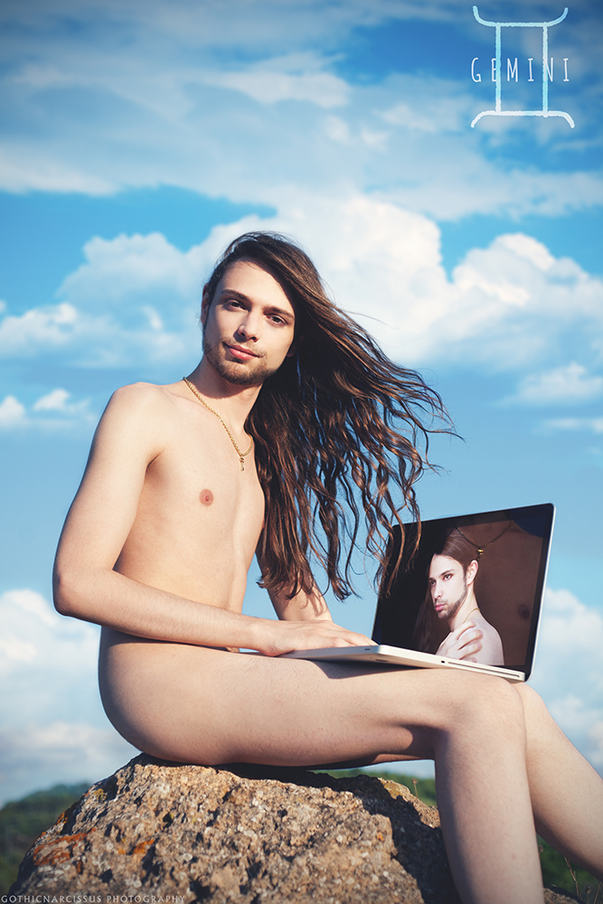
Gemini

Gemini by GothicNarcissusWhatever I feel for you,
You only seem to care about you.
Is there any chance you could see me, too?

[ I Love You – Woodkid ]

Sign of the Messenger
Element: Air
Secondary element: Wind
Planet: Mercury
Alignment: Light

The first work from my brand new project called The Zodiacs is my own star sign, Gemini.
A Light-aligned Air sign best represented by Wind, derived from the constellation of the Twin Brothers, Gemini is called the Sign of the Messenger because, due to its element and its ruling planet Mercury, perfectly embodies the bridge between worlds. Usually playful and outgoing, if not downright mischievous, it is prone to several mood switches because of its dual nature.

You can read a much more detailed description of my star sign on The Gay Boy’s Guide to the Zodiac, from which I drew inspiration for the whole project, but we can basically say that the main things on which I built the symbolism for this work are there.
First of all, the problem with representing Gemini is that, well, they are two. Since I want to keep this project as much “photography only” as I can (unlike the Infernal Lords in which the digital part is much more prominent), this was the first major obstacle I had to overcome – I did not want to place a photomanipulated “second me” somewhere there, and a mirror or any other reflecting surface was out of question due to its infinite banality. Digging deeper, I found that Gemini are the most communicative sign of the Zodiac (something I apparently seem to be often forgetting about), which of course includes all electronic devices. This is why I decided I would be holding a Macbook (Electricity is most often regarded as a secondary element of Air, too), which gave me the idea to put the “second twin” as a photo showing on screen.
Pollux and Castor were twin brothers, but somewhat opposite – Pollux was immortal while Castor wasn’t – thus Gemini has this kind of polar opposite thing in it: while one of the twins is contend, playful, light and extroverted, the other is somewhat murky, contemplative and introvert (showing the backside and in a “defensive” pose). Beside that, I aptly waited for a windy day with scattered cumulonimbus to give the connection with my element. And this is how the aesthetics and symbolism of the photo was born.

I was lucky enough to have my mother’s help for this work: she drove me out of town, then we went into the wild, and she helped me taking the photos under my direction after I set up all the stuff.
On a side note, this is my very first true nude as a model. I thought I would never pose fully naked because, despite what it might look like, I’m the shy twin and am very self-aware about my body. Yet, for one thing I already know it will be difficult to find all the models for this work, so I was in no position to shy around; for another, I must thank the Guide for pointing out that my extra-slender body frame is most often associated with Gemini, which was of much comfort and took me a step further towards accepting my body the way it is. In many ways this work was cathartic and I am very proud of what I have accomplished. It went very smooth, so I hope it will bring me luck and make the rest of the project go on just as naturally and easily.

The Zodiacs

Perhaps, with about five or six other projects still going on and not even close to be finished, I should have not embarked in the umpteenth long-term, difficult project. But as I said once, inspiration strikes in the most unexpected moments and forms, so here we go, once again.
This time, I got the idea reading The Gay Boy’s Guide to the Zodiac, an amazing and amusing blog which explains astrology from the perspective of a gay boy, specifically about how zodiacal signs work on gay boys. I had a lot of fun while reading it, and bam!, the idea struck: I’m going to make a series of works about the zodiacal signs.
Well, I admit that’s a very common and not so original subject, but while I was reading, I kept having images about how I could do my own zodiacal signs so, perhaps, I though, I might have my say too. The idea of seeing the zodiac from a gay boy’s perspective feels quite thrilling and has a lot of visual potential, so why not? And this is how I got back to reading the blog from the beginning and started noting down the most defining traits of each sign to try and elaborate a visual image out of each of them. The idea for The Zodiacs was quickly born.

I guess everybody knows how the Zodiac works, but here’s a small recap: there are twelve Signs based on the twelve constellations that the Sun crosses during its apparent journey along the ecliptic. When the Sun crosses one sign, all the people who are born in that period of time will have traits, character and often physical, linked to that sign. This traits are mostly derived from three things: the mythological background of the constellation, the element associated with the sign and its ruling planet.
The twelve Zodiacs are grouped in four elements, three for each: Fire, Earth, Air and Water. Each sign has its own secondary element, which helps further define its character along with its ruling planet.
The Moon and the other planets, too, cross the signs during their apparent journey around the Earth, their position at the time of one’s birth affects their characters too, as well as the Ascendant or “rising sign”, but since the Sun is considered the “planet” of the self, it is its position that defines most of the traits of one person.

With this said, I will shoot one themed photo for each of the twelve Zodiacs. The aesthetics will be closely related to the description of said sign and will include its dominant element as well as a handsome young man who embodies the main traits of each sign with his looks, pose and attitude. Oh, and each boy will be naked.
This is indeed my first long-term project including nudity. As you can probably reckon, this will mean it will be a long, difficult and slow project, since finding twelve boys who not only are preferably born under the sign they’ll be representing, but are willing to pose naked too will be a very challenging process. But I guess we all know by now I love challenges, so I’ll give it a try.

The first photo from this project will be published very soon. Meanwhile, here are some questions about the project you might ask me at some point:

• Why the nudes?
• It’s symbolic. Whereas the ascendant is meant to represent one’s projection to the outer world, the sun sign represents one’s inner personality, without masks or covering. The zodiacal sign is metaphorically “one’s naked self”, no more, no less. I have always had a very complicated relationship with nude photography and it took me long before I did my first nude shootings. I did them only because I had some concepts I could not represent otherwise, some images in which nudity was strictly functional to what I wanted to express. This project is quite like that: the concept requires the use of nudity.

• What about astrology? Do you believe in that?
• This is a thing I really want to clear out. Most people who know me know I am in-between agnosticism and atheism and I am a huge astronomy lover. If I don’t believe in any given god and am so much into the scientific side of the study of the sky, fat chance I can even believe in astrology, right? Well, not quite that.
For one thing, my mother is very interested in astrology, so I grew up being quite interested in it too. I don’t say I strictly believe in daily horoscopes and such things, but that does not mean I don’t like playing with the idea of natal charts and how people reflect the traits of their signs. The thing is, astronomers are very quick to dismiss astrology as nonsense on the basis that planets have virtually no influence whatsoever on Earth, that astrology lacks any scientific foundations and so on. On the other hand, astrologers have never made any claim about astrology being scientific in any way and consider it more of an art. An interpretative art. It’s not like they believe that planets emit some kind of energy that affects mankind differently according to which starry background they stand in front of: it’s more like watching the apparent position of the planets against the zodiacal portion of the sky and interpreting it to try and divine mundane things. It won’t surely give you an answer about what’s going to happen next, but it might give you the caution or the confidence you need to undertake things on a given day. As for natal charts, it’s not like astrologers tell you who you are going to be, how you are going to behave, what you’re gonna do in life and stuff. Zodiacal signs are simply archetypes, they map out people’s possible worths and flaws, which allows them to work on themselves to become better. There’s nothing scientific in it, but it’s still very fascinating. And honestly, I know very few people who do not fit their own sign (and casually most of those either fit their ascendant until you get to know them better, or have some group of planets that heavily influence the main sign). So, honestly, astronomers can give up their fight and let astrologers alone, one does no harm the other.

• What about Ophiuchus, the thirteenth Zodiac?
• Bullshit. There are only twelve zodiacal signs, period. Basically, this is the thing: in modern astronomy, the term “constellation” does not define the “pattern” that stars make up, but rather an area of the sky that’s assigned to said constellation in order to easily catalogue deep sky objects. Of course, this includes a much larger area surrounding what “we” call the actual constellation. This new official definition of “constellation” is not older than the 1920’s, while the division of the sky was made in 1930 and was largely arbitrary. It so happened that an area of sky in which the ecliptic lies, and which is very close to the Scorpio asterism, was assigned to Ophiuchus rather than Scorpio: this is how all of sudden there were thirteen zodiacal constellations. It was arbitrary, it could have been Scorpio instead. And as you can see here, the area that lies between Scorpio (bottom right) and Sagittarius (bottom left) does not even contain the asterism of the Ophiuchus. So, given that, a) the Sun doesn’t even enter the “constellation” of Ophiuchus as traditionally defined, b) as stated above, astrology is a totally different thing than astronomy and it has been so for the last five or four centuries, c) the whole symbology linked to the number twelve is millennia old and rooted back to the Babylonians, and d) the thirteen zodiacal constellation claim derives from a mere agreement rather than any scientific observation, there’s no point in introducing a thirteenth zodiacal sign in astrology. Is it?

Tuesday, 11 June 2013

Once

Once by GothicNarcissusHere we are, at careful distance.
Here’s my heart, what’s left of it.
In this town, I used to listen,
Once, once, yeah...

I had hope, blind faith,
Had as much as you could take.

I’m only gonna let you kill me
Once, once, once, yeah.
I’m only gonna let you kill me once.

Ashes burn the morning after.
Only know I’m here to stay.
I was so, I let you see me;
That was dumb, but that’s OK.
Tripping down to your place.
What is love anyway?

I’m only gonna let you kill me
Once, once, once, yeah.
I’m only gonna let you kill me once.

Who or whatever you do,
Don’t let anyone hurt you.
Touch them where it hurts
And watch them leave.

[ Once – Hurts ]

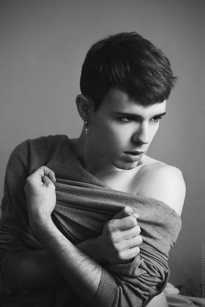
So, remember when I complained about Hurts covering Bruno f*cking Mars? Well, the source material isn’t much better in the case of Once, originally by a Diana Vickers, which Hurts covered during the Happiness era (I don’t know if they released it officially somewhere). Seriously, the original is as dull as it can be, with boring chords, a boring arrangement, an even more boring vocal performance… and yet, Hurts’ version is so beautiful and inspirational, rich with raw emotion. Therefore, Locked Out Of Heaven I included mostly out of pedantry, but Once I did want to be in the project.
And yes, this was the photo I was trying to shoot when Locked Out Of Heaven happened instead. See, it was visually nice, alright, but just too tame: the general direction was that, but it lacked the sheer nervousness of the cello, the gut-punching emotion of the final chorus… it was still a bit Vickers-ish in terms of impact, until I realised it could be Locked Out Of Heaven. But for Once, I had to step up the game.

In general, when thinking of a visual rendition, I decided to do a fashion-oriented photo but set it in a domestic location, so it would retain the posh imagery I associate with Hurts music without losing genuineness. The idea was rather sketchy and undefined, hence why the multiple attempts that took a life of their own.
I was basically aming at a moning-after kind of situation in which one of the partners is leaving (offscreen) and the other one is torn: there’s still passion and feelings and desire, but self-respect is emerging and causing an inner conflict of sorts. Thus, the stark contrast between highlights and shadows, the messy bed, the clenched fists on the stretched sweater. The first two I nailed in Locked Out Of Heaven, too, but I think the sweater trick is what sells the raw emotions here. I’m glad I tried to take it to the next level, I’m very satisfied with this photo.

Sunday, 9 June 2013

Locked Out Of Heaven

Locked Out Of Heaven by GothicNarcissusNever had much faith in love or miracles,
Never wanna put my heart on the line.
But swimming in your love is something spiritual,
I’m born again every time you spend the night.

‘Cause your sex takes me to paradise,
Takes me to paradise
And it shows, it shows.

‘Cause you make me feel like
I’ve been locked out of heaven
For too long, for too long.

You bring me to my knees, you make me testify,
You can make a sinner change his ways.
Open up your gate, ‘cause I can’t wait to see the light
And right here is where I wanna stay.

‘Cause your sex takes me to paradise,
Takes me to paradise
And it shows, it shows.

‘Cause you make me feel like
I’ve been locked out of heaven
For too long, for too long.
You make me feel like
I’ve been locked out of heaven
For too long, for too long.

[ Locked Out Of Heaven – Hurts ]

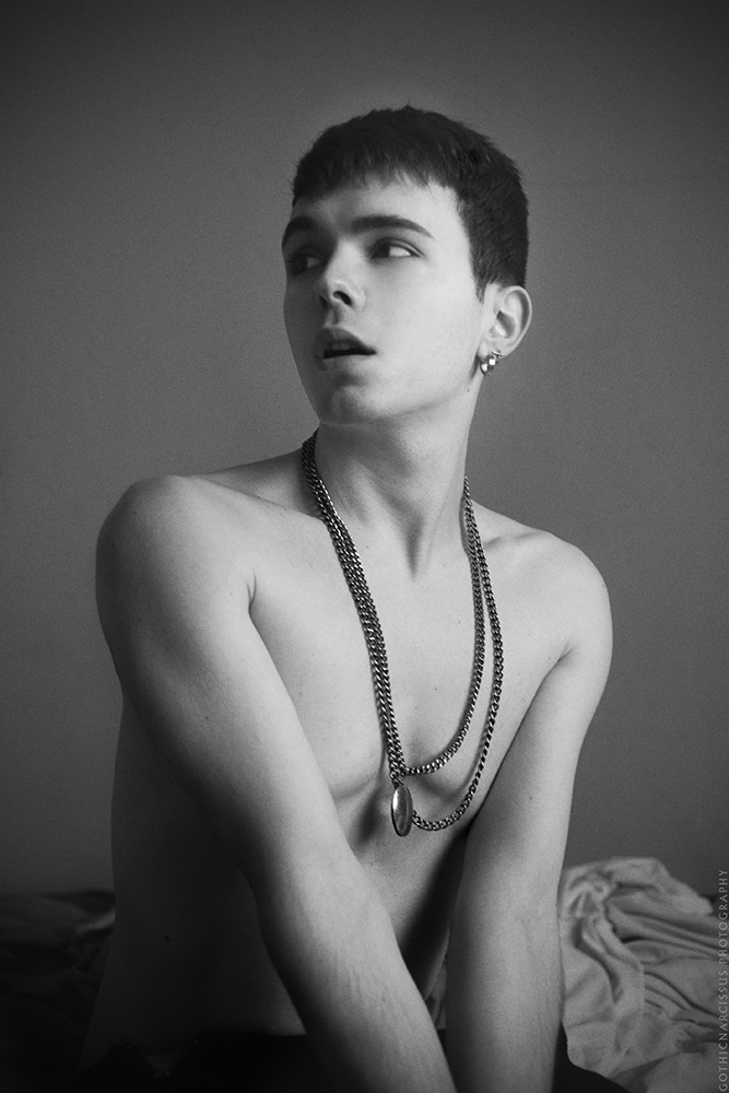
You know those moments when you’re going for something, but can’t quite reach it, but then you realise you’ve actually got something else entirely?
Well, that’s this photo. I was trying to pull off another work for the Inspiration Hurts project, but didn’t really capture what I wanted, until I realised this photo embodied pretty well Hurts’s cover of Bruno Mars’ cheese. How these guys could turn it into a compelling (albeit still highly melodramatic) song is anybody’s guess, but it felt wrong to cut it out of the project and I’m glad its visual rendition kind of fell onto my lap.

Of course, the everyday-life-meet-fashion-photography feel was more of a leftover from the concept I was originally working with, but it still fits the general mood of the song. Besides, I couldn’t go too holy and sacred with the visuals because in this project alone we already have Miracle and Heaven, and I need to differentiate. Look, it’s nice but it’s still a Bruno Mars cover, it can’t get all the good stuff.
Anyway, I think the contrast between highlights and shadows is what sells it: the head is facing backwards, to the darkness, while the rest of the body is already facing forward to the light. meaning that the exile from heaven isn’s quite over yet, but is’s about to be. I’m rolling with it.

Thursday, 30 May 2013

Hollow

Hollow by *GothicNarcissusWaking, falling stars from substratum.
Who holds the key to break the old bonds?
Stare into space
Until you cannot see your face.

I turn away.
I turn, but never get back.
Trying hard to be someone,
In return you end up hollow.
Like a sinking ship I float,
A stormy sunny day, I turn away.

I’ve come to realize this is gone tomorrow.
Brittle and frail, we will fall down.
All that we are is a means to an end,
It doesn’t matter what you do.
Give me your hand and open up your eyes,
And burn away, release yourself.

I turn away.
I turn, but never get back.
Trying hard to be someone,
In return you end up hollow.
Like a sinking ship I float,
A stormy sunny day, I turn away.

I will not follow you
Across the silver sky of summer.
And like someone from tomorrow
I sense innocence.
In my dreaming
I wasn’t sleeping.

I turn away.
I turn, but never get back.
Trying hard to be someone,
In return you end up hollow.
Like a sinking ship I float,
A stormy sunny day, I turn away.

[ Hollow – Theatre of Tragedy ]

I have never quite understood why, but for some reasons Hollow, Frozen and Illusions by Theatre of Tragedy, all of which are found on their last album Forever Is The World, are intrinsically connected with one another in my mind. And beside that, I love them very much: they’re beautiful, emotional and inspiring. While single verses from them have inspired me since 2009 (even at the same time, as in Frozen, Hollow Illusions), I never quite had the idea for an image that could represent them as a whole. I did not want to “waste” them on “unworthy” photos, so to speak, thus I preferred waiting for a very strong concept to form in my head.
Finally, last January, I learned from my friend Uriele a nice digital technique to turn writings into watercolour-like graphics. At first I just put it aside until, while wandering the centre of Milan one morning with Theatre of Tragedy in my ears, I got carried away with one of my usual reveries and the idea for a Hollow-inspired picture struck: what if I tried to combine some photos on an empty white background, like they were to be published on a glossy fashion magazine page, and insert such a title in-between them? It could turn out to be a cool idea if I planned it carefully.
I decided straightaway what the photos themselves would look like (as that was part of my daydream) getting inspiration from the keywords in the lyrics, then I headed to the nearby Galleria Vittorio Emanuele II to check if everything was in place and if it was possible for me to put a model the way I wanted – which was definitely the case. The choice of the location was not random: ever since I shot Machinery Of The Stars, in my ming that place is strongly connected to Theatre of Tragedy and represents specifically the “silver sky of summer” mentioned in the lyrics. The floor also has stars (that’s one thing I had to check) and in the afternoon the Galleria gets a beautiful light that would fit the mood of the song perfectly. Uriele, who’s an amazing model, also happened to have clothes that fit my idea, so everything was in place. Once I got home, I did some experiments with the digital watercolour technique and the result turned out very pretty. For some reasons, I’ve always associated Hollow with sepia, so that became the main colour of the title and the dominant hue of the photos in the postproduction. All the pieces were in place, my idea could really work.
Truth be told, I didn’t set the plan in motion until last weekend because I’m a lazy ass, but given the murky weather I found pretty much each other time I was in Milan earlier this year, that sunny afternoon was the best choice to get the right mood. I regarded the photos as actual fashion shots: my “story” could be perfectly told through a portrait, another photo showing some detail of the outfit and some view of the architecture from the location of the shoot. The result exceeded my highest expectations.
I’m planning to develop Frozen and Illusions the same way I did Hollow, although it’s going to take some time because I don’t have an exact idea about the latter yet, while the former is perfectly mapped out but will have to wait till winter for – err – obvious reasons. In the meantime, I did other experiments with the watercolour technique which became another project I will publish tomorrow or the day after. But now, I really hope you’ll enjoy Hollow, perhaps while listening to the beautiful song that inspired it in the first place.

Monday, 20 May 2013

I just opened Pandora's box

This morning I had a totally unexpected travel back in time while browsing my external hard drive for a photo of a friend of mine. Beside some dreadful old photos of a short-haired, 16-year-old me, I came across a folder called “Gothic Sanctuary” and, quite oblivious of what on Earth it could be, I double-clicked it. Gosh, did I open Pandora’s box: that folder contained a lot of old pics I collected back in 2006. Photographs, photomanipulations, digital paintings… all sort of things as dark and gothic as they could be. Back then it was the time when the web was slowly letting go of goths and emos were taking over, but the lines were still kinda blurred and you could find a huge lot of stuff of that kind. I was between 16 and 17 and thought those pictures were the coolest things on Earth. And that’s pretty much where my journey as an artist began.
The beautiful pearl-skinned lady in the forest.
Truth be told, at first I was nothing more than a collector. I used to play on a fantasy medieval-themed online GdR which first got me introduced to the gothic imagery. It was the second half of the 2000’s, basically the golden age of “modern” goth subculture, so just imagine: Queen of the Damned was still all the rage, Van Helsing was totally a thing, Evanescence still had a cult following who eagerly awaited Fallen’s follow-up and such bands as Within Temptation were starting to truly rise to prominence, while third-generation female-fronted bands like Delain were blossoming. That GdR, which was very big at the time, was literally full of dark-haired, pale, tormented girl-characters and elegant, murky, silent boy-characters, so it was a full immersion of gothy stuff and I was growing hungry for more. At first, it was just all about googling around, finding blogs and sharing the photos with my friends through MSN Messenger. Looking at them now, I find most of them terribly clichéd, poorly executed and even a bit ridiculous, but Goth (pun intended), were they amazing back then. Some of them, though, were totally on the next level and it was looking for them that I finally discovered deviantART, whose members had a much more serious approach to the imagery. I was so impressed that I wanted to do something like that too. Such artists as Bionic7, Princess-Of-Shadows, Blackeri, Wishmistress, Enyala, Parlami and BellZ kept producing amazing images and I was totally bewitched by their work. I wanted to be like them. I wanted to do stuff like theirs. I wanted to produce very dark, desaturated, white-skinned, candle-lit, heavily textured, fantastic, tormented works that goth teen blogs would love as much as I did. I wanted heavy make up, layered hair, fancy clothes, dark fairies with dragonfly wings, plumed fallen angels, bleeding mascara. That’s all I wanted to be as an artist.
The beautiful princess with ebony curls The tragic heroine hidden in her underground wonderland
I think what saved me back in the day was my lack of Photoshop. Now that I actually know what photography is, I treasure it as a valuable item but I realise, if I’d had it back then, it would have been my undoing. As I only had lousy softwares like Ulead Photoexpress , I couldn’t just put the camera on my desk, take a random photo of myself and then do all the magic in postproduction. My shortcomings forced me to do the bigger work in pre-production, putting an extra dose of care into the location choice, light, outfit and concept. Everything had to look at least decent from the very beginning, for whatever intervention I could do afterwards was extremely limited. At first I sort of settled to doing that while waiting for “someday” when I’d have the expertise and better tools to do the oh-so-cool stuff, but just after a few months I enjoyed what I was doing so much that I decided I would go on as a photographer rather than a digital artist, I would keep shooting on location rather than using stocks and natural colours suited my work without too much monochrome filters.
The dark fairy
Truth be told, as technically lousy and last-decade as they seem now, those images still make my heart quiver with nostalgia and smile softly. I’m miles away from what I though I’d be back then, I haven’t even really got close to that, but at least I stayed true to myself rather than turning into someone else’s copycat. I’m satisfied with what I’ve accomplished so far and eager to grow and accomplish even more. I’m glad that I’ve been through that phase and also that I’ve found that folder this morning: that’s the foundation of who I am and I will carry that world in my heart and at the very core of my work all my life. Sometimes you just need to remember where you come from to look more clearly to the future.